If you run a website, you will have heard the abbreviation WCAG. What do you really think of those letters? Annoying stick? Inspirational carrot? The guidelines for accessibility are constantly changing, and with new versions come both sticks and carrots to ensure that most websites in the world will be easy to use for everyone - regardless of functional ability.
There are many good reasons to comply with the WCAG rules, but the truth is that when a website is to be created or updated, accessibility quickly falls away when the budget approaches the red and the launch date is lurking around the corner. It is mostly only public websites that are good enough in the end, because they have to meet certain requirements to be approved.
But here are a few more reasons, just in time for the release of WCAG 2.1 tomorrow:
- There are over 2,2 billion people with visual impairments worldwide
- 30,000 people have epilepsy
- It is difficult to put a number on motor impairments, but many also live with this.
- 1,5 billion people have various forms of hearing impairment
- Many people live with challenges related to concentration and memory
The number of potential customers we are talking about is, in other words, very large. They subscribe to streaming services and digital magazines, buy products in online stores, take online education and donate to charity via electronic forms. To not take these needs seriously when developing a website is a big mistake. Both ethically and economically.
What is WCAG?
WCAG stands for Web Content Accessibility Guidelines. The guidelines are divided into 4 main areas and can be remembered by using the acronym POUR.
- Perceivable - Content must be perceivable by more than one sense
- Operable - One must be able to navigate in several ways
- Understandable - the website must be understandable and predictable
- Robust - The site must be able to cope with software updates and still be available.
You can find a full overview here, but you probably see the point: This list isn't just good for people with disabilities - it's good for everyone.
What's new in WCAG 2.1?
As technology develops and new ways of using the internet become more widespread, accessibility requirements will change and/or be added. In that sense, WCAG 2.1 is just a natural continuation of 2.0, where some things have been added. Generally it is largely about requirements that support the use of tablets and screen readers, with some additional elements.
However, the biggest change for Norwegian, as well as other countries, websites is the declaration of availability which is now required for public websites.
How do I check if my website is accessible to everyone?
Apart from letting a designer with expertise in the field do a thorough check, there are some simple things you can do yourself to test if your website is accessible. You will not be able to capture absolutely everything, for example if you do not have access to a screen reader, but you'll get a good idea of roughly where you stand.
If you do find that your website is in a bad state, we would be happy to talk about which requirements you can and should meet, and how you can meet them as easily as possible. Just send us a request on our contact page and we'll get back to you quickly.
Turn off mouse and trackpad
The task is simple: Try to navigate around your page using only the keyboard.

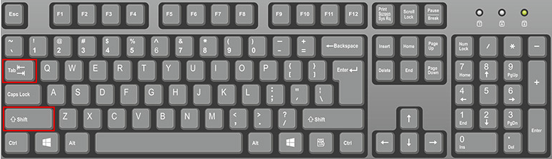

Check especially forms, video players etc. Are the elements selected in the same order as they appear visually? Are there any elements that cannot be navigated to? Can you see where you are at all times? If you answer no to any of these questions, you need to take action.
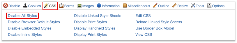
Disable CSS
CSS is a file that describes how HTML should look like, i.e. what websites are built from. HTML can, for example, say that there should be a button on the page, and say something about where this is placed in relation to the other elements, while CSS says the button is blue, has round edges, etc.
The reason we turn off CSS is that many people with visual impairments have their own CSS files that make it easier for them to identify clickable elements. For example, if your website uses a background image as content, this will disappear when we turn off CSS, and the content will be impossible to find for these users.
Remember that visual impairments are more than being blind! It is one thing to adapt the website for screen readers, but not all visually impaired people use one like that.
I'm using Chrome as an example, but you can check this article for instructions for some of the most common browsers.
The easiest way is to add an extension called Web Developer. Open it by selecting it in the menu bar at the top right of the browser. You may need to click the puzzle piece to bring up all your expansions.
Then select 'CSS' and 'disable all styles'
Then ask these questions:
- Did any important elements, links, or content disappear?
- Is the content difficult to understand?
If the answer to any of these is yes, your site is not working well enough.
Check if all media is subtitled or transcribed
All videos and audio files should be subtitled, or the content should be available as plain text. The player itself should also be accessible and navigable so that the user can choose to turn text on and off. See for example the built-in text function in the YouTube player.
Check fields where the user can enter information
I mentioned forms earlier and they are usually the biggest culprits here. For example, does your form have a field that looks like this?
The text 'Your full name' is called a 'label'. It must be possible to select it with the keyboard. When you press 'Enter', the pointer should automatically jump into the field so that you can write in it.
There are other things that should be checked, but this test takes care of the mistake most people make: not having labels to navigate to. Without being able to write in a field, the user cannot donate to your charity either!
Test high contrast mode
Many visually impaired people use this mode. To turn it on in iOS, go to the apple menu and select 'System Preferences'. Then select 'Accessibility' and 'Display'. Click on 'increase contrast' and you will see that the display changes. You can also set how strong this effect is on the slider below.
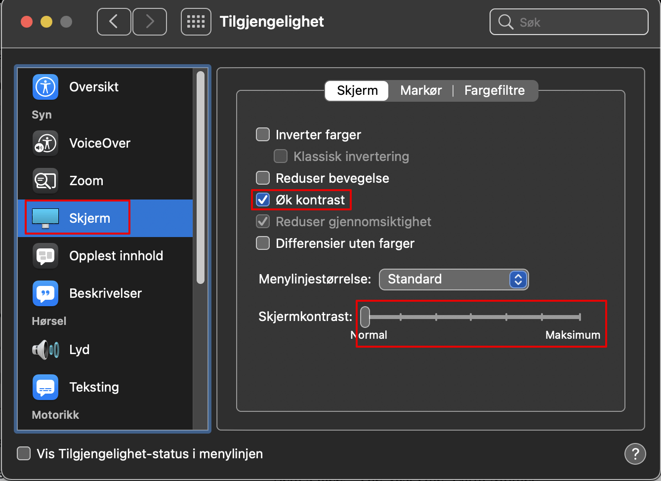
Feel free to also test the other options here to see how your website reacts.
Remove images
This one is similar to the point about removing CSS. Images can actually be a good thing to make the page easier to understand, but they must not be required to be able to use functions.
Just open Web Developer again, select 'Images' and 'Disable Images'.

Then ask the questions:
- Is there any content missing?
- Is the site more difficult to navigate around?
- Is the page more difficult to understand?
- Is there anything you can't do now that you could before?
Accessibility should be built into the solution, not tacked on later
If you already have an inaccessible website, there are of course things we can do to repair it. But to give users the best possible experience on the website, it is best to design it with accessibility as an important specification. You will then get an accessible website instead of a website with accessibility functionality.
This is an important distinction, which those with, for example, an old car will recognize. You can soundproof, install a new catalytic converter and use a fan hat while driving in the summer.

But most people get a better experience with a car where these things are integrated into the design itself.