
.jpg?width=1029&height=514&name=Featured%20image_%201100x550px%20(30).jpg)
Universal design of websites allows as many people as possible to use the website as intended. If you own a website in Europe, you are required to meet certain requirements for universal design.
In Norway 636.000 people under the age of 66 years old have some sort of disability. Most people have issues with their vision, even when wearing glasses or lenses. Maybe you feel it yourself? That you have to squint and concentrate to see what is written?
About 15% of the worlds population have some form of disability.A large part of your target group will have a better user experience on your website, if you make sure to meet some relatively simple requirements (WCAG 2.1: Norway / Europe)
It’s easy to get lost in the complexities of accessibility rules. However, it’s easy to learn their implementation from good examples.
Some organizations already take great care to be accessible to their users. Their experience in implementing the rules in mature products can help us understand the philosophy behind accessibility.
An experience for every citizen – Gov.uk
Yes, this is a government website. And as such, it should include every citizen in their target group. Few do it as well as the British gov.uk website. The experience is very well planned – no matter what input device the user may use. It’s main strong points are:

- High contrast layout, with big texts and good font choice, that is both visible in various conditions and easy on the eyes.
- Visible text hierarchy that makes it easy to understand the relations between content parts.
- Obvious links and stand-out selectors (the yellow & black really stand out even on a small screenshot).
- A website structure that lets you navigate efficiently without touching either your mouse or touchscreen (e.g. using keyboard or voice commands). You jump into the right content without the need to skip the side menus, while still being able to access them if needed.
Shortcuts that make the navigation a breeze, even on content-heavy pages (for example: Jump to content visible at the top of the page, that lets you skip the menus if using keyboard or voice).
A specific feature of this government website is that it relies almost exclusively on text. There are very few images, and almost no other media. This way the developers of this page make sure that every device capable of understanding a web page can present it in a meaningful way, while reducing the costs of maintaining media alternatives – like close captions for video or text alternative to sound files.
An accessible media company – BBC.co.uk
Another good example is a very media heavy page: the British Broadcasting Corporation, one of the UK’s main media outlets. This specific web page is a good example of handling non-text content. That means in specific:
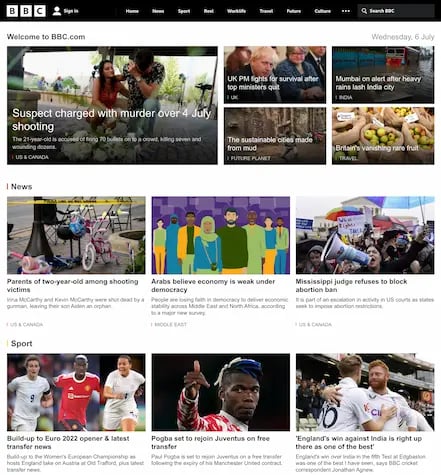
- All the images have alternative text that lets users understand the illustration without seeing it.
- BBC uses its proprietary iPlayer for displaying video content. Most of the videos contain subtitles that allow people to access the content without relying on sound.
- The subtitles are on by default and the player allows for changing their size.
- A website structure that lets you navigate between headlines and topics easily with keyboard or voice.
- The site allows for skipping the menus and easily navigating to the FAQ (it’s the second link while using the Tab button, just after skip to content).

A good benchmark for media sites, BBC is an accessible page that users can enjoy despite using alternative input or output methods. Not, however, that even this media juggernaut does not provide all the time-based media (video and sound recordings) in text and sign language.
They write: We aim to provide subtitles, audio description and programs in British Sign Language for as much content as possible across as many devices as possible. That highlights the importance of planning ahead for video and sound content: would you be able to provide alternatives? If not, it may be a better solution to limit the number of non-text content to minimum, and treat it as inaccessible to some users.
An innovator in energy market – Bulb.co.uk
This is an energy company website. It focuses on providing green electricity and empowering their users with control over their bills. It's plan may be described as an energy company for modern, user-experience conscious clients.
This is a good way to stand out from competition, that in this specific market, seems to be far behind in web services. And part of the experience is being accessible. Because that means that Bulb may be chosen before others by any user with non-standard needs.
Their web experience is modern, but not flashy. They rely on clean structure and well crafted texts. Where images appear, they are to illustrate and supplement the text, not the other way around. Main highlights include:

- Great contrasts throughout the website. Bulb manages to establish a bold, significant brand identity without sacrificing the accessibility of its content.
- The links are obvious, the change states indicated, and text hierarchy is clear at a glance.
- Simple, well planned site structure. Most of the sub pages are presented in one column, with big text and no distractions.
- Alternative texts to every visual media.
- Help videos have an alternative as a step-by-step text instructions.
- Ability to navigate with a keyboard or voice throughout the site.
Bulb is a good example of a commercial website that uses accessibility as a key part of the experience. It attracts customers that other energy companies may overlook or ignore. As such, it seems to be a trendsetter in its market and we expect more energy brands to follow.
Summary
The good practices illustrated above have a profound impact on user expectations. No longer can users tolerate poorly organized content, no alternatives or difficult navigation. While, at the same time, taking care of accessibility issues makes the overall experience better for all the users.
Think about the page structure: if done well, both screen readers and eagle sighted users can arrive at the desired content easier, and the site would fulfill its purpose better. Overall everybody wins.
It’s just the beginning of the journey for improvement that’s daunting. And that’s where having an experienced guide is so valuable.
Need a partner in turning your website into an accessible site with great user experience for anyone? Feel free to reach out to us here.


.jpg?width=308&height=173&name=Featured%20image_%201100x550px%20(50).jpg)
